Illustrations as well
It's easier for everybody
Sorry, but you either have no stories or none are selected somehow.
If the problem persists, check the browser console, or the terminal you've run Storybook from.
Design tokens are the single source of truth to name and store a design decision, distributed so teams can use it across design tools and coding languages. They are exported from Figma using Supernova.
Design tokens are the foundations of a strong Design System — they are «the visual atoms of the Design System». Tokens are a set of visual properties such as colors, sizes, shadows, animations...
Ours are using a semantic nomenclature instead of a simple description. That way, they create a common language not depending on the component type or the platform where it lives. It ensures developers and designers speak the same language. Tokens make it easier to build our product by improving communication and design-to-code handoff, enforcing a logical approach behind every design decisions they can target.
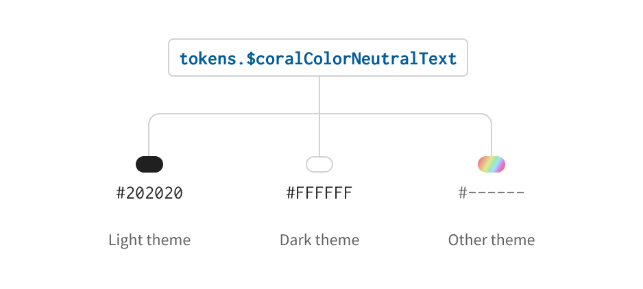
With Design Tokens, themes are much easier to handle. Each token is purely semantic, its value is dependent on a theme file - a stylesheet assigning a value to that semantic name.
When you implement a component using tokens, you are guaranteed that this component will
support any theme. To get different themes to take effect, simply load the correct
stylesheet and update the data-theme attribute and you’re done.
With tokens, designing and implementing once works for every possible theme. Components built with tokens are resilient.
Theme switchingClick on the icon button to see theme switching in action
With tokens, designing and implementing once works for every possible theme. Components built with tokens are resilient.
It's easier for everybody